Seller Onboarding
OPENDOOR
Website
Growth
Lead designer
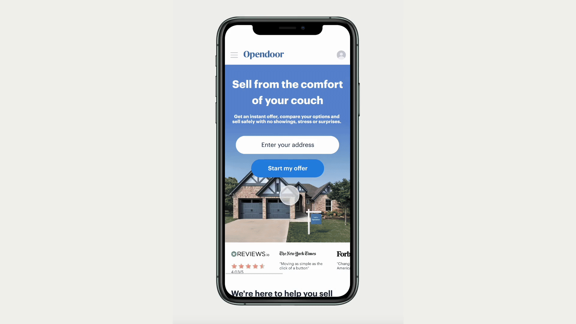
Opendoor's main service simplifies the traditional real estate process by providing sellers with direct home offers. A crucial element for this is a well-designed and efficient onboarding funnel. My role at Opendoor involved not only optimizing the funnel but this project allowed me the chance at experimenting with significant changes for greater impact.

Challenge
Most Opendoor customers primarily just curious about a home offer, but were deterred by the requirement to answer several questions, some perceived as irrelevant, and were reluctant to share contact information due to concerns over unwanted communication. This customer-business misalignment leads to significant drop-off, especially post-home address entry. Moreover, there were opportunities to enhance this experience through engineering and design improvements and to boost overall conversion rates.
Existing Experience

This is the only page that provides additional education on the left side panel. This is a missed opportunity to provide more information regarding each question. Education also isn’t present in mobile.

The core product had recently gone through a re-design and the onboarding funnel was out of date visually. Additionally, these pages weren’t built with flexibility in mind.

The onboarding flow also includes questions that we no longer used to effectively evaluate an offer for the customer. Including questions not used adds to drop off unnecessarily.

This page has the second largest drop off and it’s just before the customer can view their offer. We should better inform the customer of what’s next, the value it provides and why we need their information.
Goal
Develop a clear, informative, and user-friendly onboarding experience for sellers that encourages them to complete the process and view their offers.
Project Principles

Set expectations
Provide value and clarity
Build trust
Educate along the way

Don’t waste their time
Each questions is intentional and it’s purpose is clear
Flow feels easy and efficient
Flexibility is key
Segmentations allows for personalized experiences
Add/removing questions or introducing new products is effortless
Allow for rapid experimentation
Vision
On the seller design team, we conducted biannual week-long design sprints to establish a cohesive product vision. These sprints fostered collaboration and ensured that all our ideas aligned seamlessly. For this vision, I assumed responsibility for the onboarding and retention aspects, which I used as our initial guideline for this project.

Things that I focused on for the onboarding product vision were a friendly and personable feel and tone. Providing value early by giving them an initial offer price but showing it could be more accurate with more information. Using sections and visual features to guide the customer through each question. And finally, providing context as to why we are asking each question.
Exploration and Research

In the exploration phase, I delved into various ideas from our vision, experimenting with flow variations, question types, educational content, and funnel sequencing. Together with my research partner, we tested prototypes with customers to identify the most intuitive and seamless experience, one that aligns with and shapes their expectations.
Friendly and Visual
We discovered that since selling your home is usually the biggest purchase people make in their lives, being overly friendly doesn't inspire as much confidence in the credibility of this product.

Condensed and Educational
While customers preferred this approach, we discovered that making the process simpler made them doubt the accuracy of our home offer.

Home value first
This flow matches customer expectations at Opendoor, yet most abandon it, leaving us no chance to re-engage them or update them on home price changes.
Solution
Using the valuable insights from our research, we incorporated upfront expectations into the final design. We included visual cues to help customers easily understand and answer questions. We used relatable language without being overly enthusiastic. To encourage customers to schedule a call with us, we asked about upgrades since we found they were most eager to share what makes their home unique. To collect their contact information, we offered a sneak peek of an offer and assured them that we wouldn't send spam emails.
Impact
The most impactful update was the contact info collection page, which increased conversion to viewing offer by 2%. Setting expectations and providing education did not improve conversion from each question but it remained the same and customers reported feeling like they provided more context into what to expect from Opendoor.
The new design was updated to be in-line with the recent redesign and provided easy updates for future testing in the funnel.